The OpenCms 8 Demo Template Modules in Detail
Contents
|
Abstract
With OpenCms 8 come not one but two sets of demo templates - the simple Dev Demo "Basic Template" (BT) and the more advanced "Template III" (T3) module. These modules are a versatile starting point for building custom websites.
T3 has been developed to be a solid and feature rich foundation for the creation of individual OpenCms websites. BT is limited in functionality and design, but makes a good reference for developers looking at the source code since its structure is rather simple and straightforward.
This tutorial shows examples of sites that can be built with OpenCms 8 using T3 and explain configuration options and possible extensions of this template.
This tutorial goes into details of the code structure and VFS layout used for T3, as many "best practices" learned by Alkacon have been used in this template module. It shows why T3 is a good starting point for development of custom websites.
Functions of T3 get compared to BT, to point out areas in which design and functionality requirements can lead to certain development decisions.
Template comparison OpenCms 6, 7 and 8
OpenCms 6 and 7
|
|
|
|
|
|
OpenCms 8
- Template III
- The best pratice using OpenCms 8
- Can be directly used for website development
- Loose coupling of template and content types modules
- As a starting point for a web-project
- Dev Demo
- Well documented easy to understand Use Cases
- Playground for template developers
Template III and content modules
Demo Modules
The OpenCms 8 Template III frontend features the following presets:
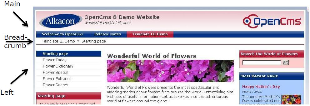
- Main Navigation
- Left Navigation
- Breadcrumb Navigation
- Configurable Layout
There is no dependency between the Template III module (com.alkacon.opencms.v8.template3) and the Template III resource types.
The following resource types are available in Template III as separate modules:
- OpenCms 8 Article
- OpenCms 8 News
- OpenCms 8 Event
- OpenCms 8 List
- OpenCms 8 Login
- OpenCms 8 Search
- OpenCms 8 Twitter
OpenCms 8 Template III
The OpenCms 8 Template III features 3 well-known navigation types:
- Main Navigation
- Left Navigation
- Breadcrumb Navigation
Those 3 navigation types are pre-configured in separate JSPs within the '/elements/menu/' subfolder of the Template III module.
The <cms:navigation> tag provides access to the navigation information. The <cms:navigation> tag is described in the /WEB-INF/opencms.tld OpenCms tag library descriptor (TLD).
A Web Container (e.g. Tomcat) uses TLDs to validate tags.
The opencms.tld describes the custom OpenCms tag library.
The navigation tag has six attributes:
- var (required)
- type(required) can be set to treeForFolder, forFolder, forSite, forResource, breadCrumb
- startLevel (optional) that reads the property "NavStartLevel" on resource or folder
- endLevel (optional)
- resource
- param (optional).
Using the navigation tag in a JSP invokes the core method org.opencms.jsp.CmsJspTagNavigation used to access OpenCms VFS navigation information on a JSP with the EL.
Example
 <c:set var="navStartLevel" >
   <cms:property name="NavStartLevel" file="search" default="0" />
 </c:set>
 <cms:navigation type="forFolder" startLevel="${navStartLevel}" var="nav"/>
   <c:forEach items="${nav.items}" var="elem">
     <c:set var="currentLevel" value="${elem.navTreeLevel}" />
     […]
     <a href="<cms:link>${elem.resourceName}</cms:link>">
       ${elem.navText}
     </a>
   </c:forEach>
 </cms:navigation>
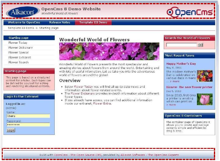
The OpenCms 8 Template III comes with a configurable header and footer. The default containerpage coming with Template III is placed at /sites/default/.content/.new/default.html
When creating a new or modiying an existing template, header and footer can be added to a page from ADE's "add wizard" by Drag & Drop. The header and footer can be directly edited in ADE. The required HTML of header and footer content are stored at /sites/default/.content/config/c_0001.html as XML content.
The path to the model containerpage can be set and changed in the Sitemap configuration stored at /sites/default/.content/.config.
As a starting point for developing your own Templates there are 3 basic pages (blank.html, twocolumn.html and default.html) which can be used as default when creating a new containerpage (e.g. through the sitemap editor).
A new containerpage is created most easily in the OpenCms 8's new Sitemap Editor. Just click the "Create Page" icon (+) and drag one of the available template pages to the position where you need it in your sitemap.
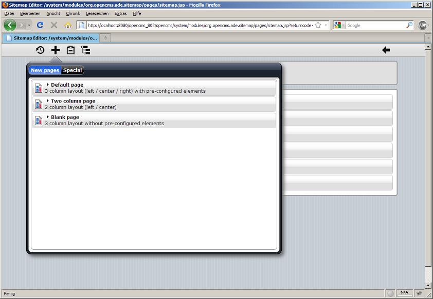
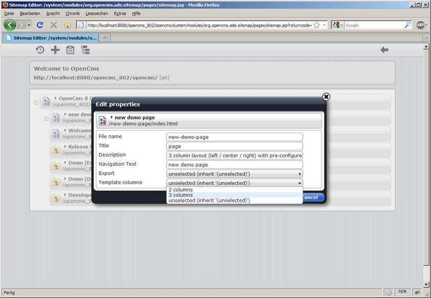
After creating the new containerpage in the Sitemap Editor, one can easily change the layout by editing the properties.
The Property Configuration in the Sitemap Configuration file at /sites/default/.content/.config defines a 2-or 3-column layout.
Template III example
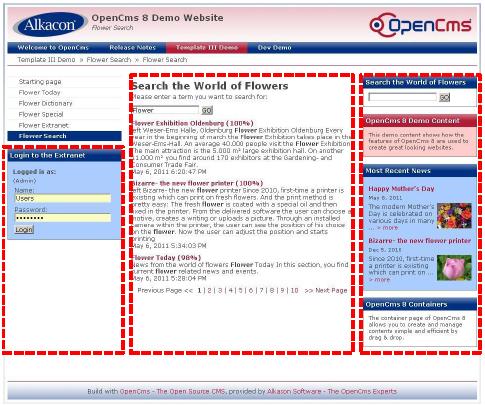
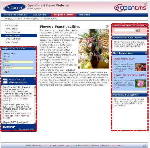
Clicking through the demo content (Wonderful World of Flowers) - coming with the Template III module - you'll find different examples of 2- or 3-column layout pages.
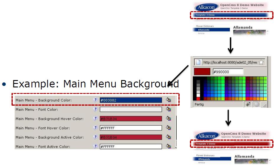
Color settings
The different colors for the demo layout are configured in a file of the resource type t3style. This file is placed by default at /sites/default/.content/style
In the demo content this is the following file with the following excerpt:
It is possible to define as many different styles as needed. The Color settings needed for a site or subsite or even a single containerpage get assigned in the "Edit properties" dialog in the Sitemap Editor. Open the OpenCms 8 Sitemap Editor and Click on "Display all resources". Now hidden resources get shown and when editing the properties of a containerpage there are more options available. From the containerpage's context menu select the option "Edit properties". In the opening layover window select "Complete Properties"
In the field "style.layout" one can change the (relative) path to the t3style file defining the color settings.
Quickly changing a style.layout of a containerpage
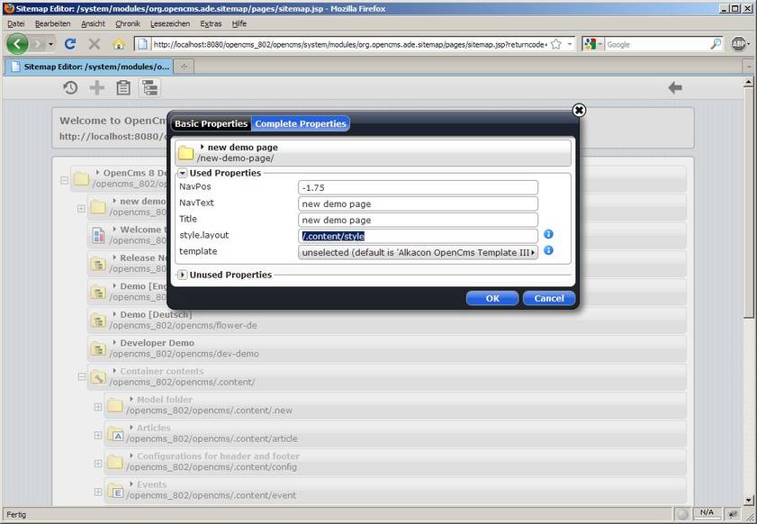
The "Edit properties" dialog in the Sitemap Editor maps this to the properties assigned to the corresponding resource or folder in the workplace's Explorer view tree structure. Alternatively you can still set the properties directly on the site folder or on a single page:
Example
- "style.columns"=3
- "style.layout"=/.config/style
The default settings are placed in Template III's main.jsp based at /system/modules/com.alkacon.opencms.v8.template3/templates/main.jsp.
Excerpts from the Template code:
 <!DOCTYPE HTML PUBLIC "-//W3C//DTDHTML 4.01//EN" …>
 <html>
   …
   <head>
     <link href=
     "<cms:link>/system/modules/org.opencms.frontend.template3/resources/css/style.css?
             style=<cms:property name='style.layout' file='search' />&
             cols=<cms:property name="style.columns" file="search" default="3" />
     </cms:link>" rel="stylesheet" type="text/css">
     </link>
   </head>
   <body>
     …
Template III resource types
In this chapter the Template III resource types are described.
OpenCms 8 Article
The Template III Article comes as a separate module com.alkacon.opencms.v8.article and adds a new resource type v8article.
The Template III Article gives functionality to define an article with:
- Title: The title of the article
- Paragraph
- Headline: The optional headline of the paragraph
- Text: The paragraph text. Freely editable HTML content. Can be edited as WYSIWYG rich text or even as HTML source code. Can contain all known HTML tags if not configured otherwise (e.g. OAMP HtmlCleaner).
- Image
- Image URI: The absolute path to the image to use. Can be directly picked from a VFS image gallery or entered as external source (remote server).
- Align: The alignment of the image
- Title: The image title is displayed when hovering above the image. Also important for SEO.
- Category: Assigns up to 5 categories to the article. Categories get defined in your sitemap in the '/_categories/' subfolder.
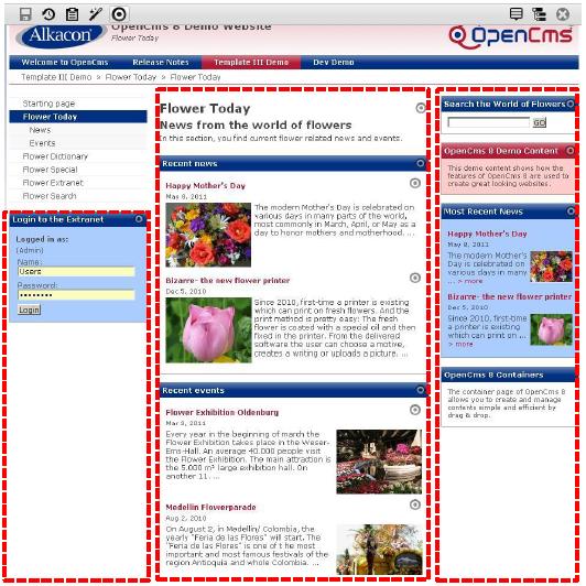
A Template III Article can be added in ADE to any webpage by Drag & Drop.
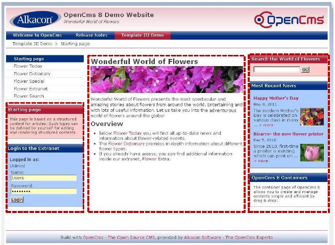
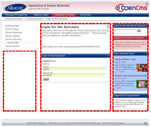
It can be dropped to any of the framed zones (3 column layout)in the given screenshot and looks like the content displayed in the center column.
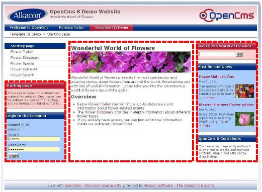
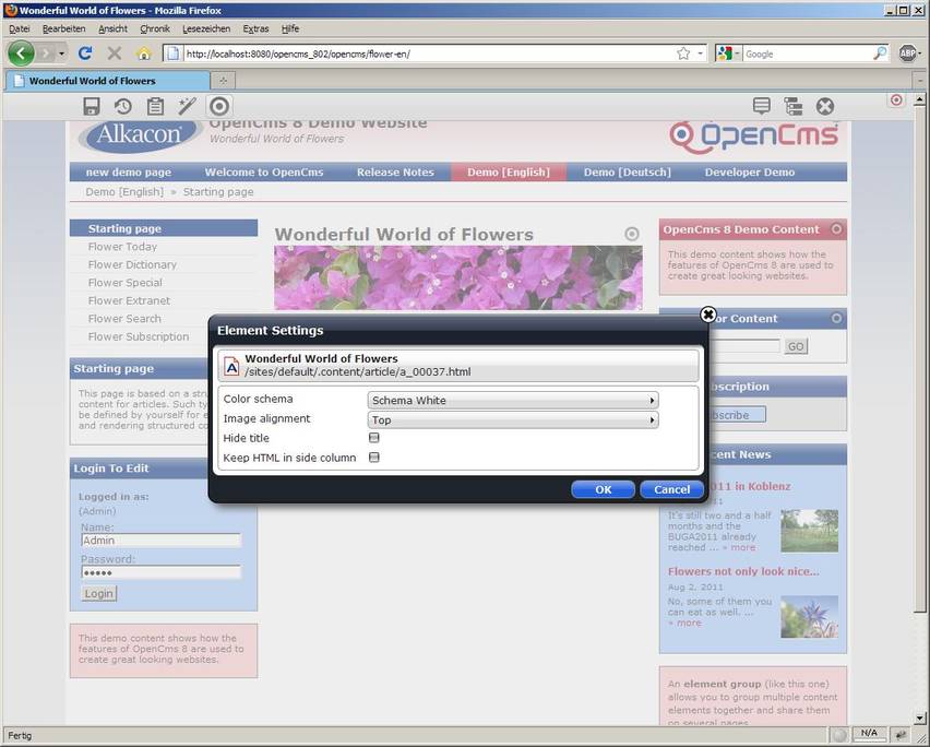
In ADE one can directly edit the article's "Element Settings".
Options are:
- Color schema: A list of available box schemas (white, blue, red)
- Image alignment: Preset of the most common setting for HTML image alignment.
- Hide title: If checked, the Title will not be displayed on the webpage.
- Keep HTML in side column
Image alignment
The image alignment can be assigned by editing the XML Content or via the "Element Settings" in the Sitemap Editor.
The following options are available:
- Left of text
- Right of text
- Top
- Left of headline
- Right of headline
The available options for Image Alignment are defined in /system/modules/com.alkacon.opencms.v8.article/schemas/article.xsd.
- XSD configuration
 <xsd:schema xmlns:xsd=http://www.w3.org/2001/XMLSchema… >
   <xsd:element name="V8Articles" type="OpenCmsV8Articles"/>
   […]
   <xsd:annotation>
     <xsd:appinfo>
       […]
       <settings>
         <setting name="imgalign"
           nice-name="Image Align"
           type="string"
           widget="select"
           widget-config="left : %(key.v8.article.image.left) | right : %(key.v8.article.image.right)|[..]" />
       </settings>
       […]
     </xsd:appinfo>
   </xsd:annotation>
 </xsd:schema>
- Formatter:
 [..]
 <c:set var="imgalign">
   <cms:elementsetting name="imgalign" default="left" />
 </c:set>
 <c:choose>
   […]
   <c:when test="${imgalign== 'left'}">
     <c:set var="imgclass">left</c:set>
   </c:when>
   <c:when test="${imgalign== 'right'}">
     <c:set var="imgclass">right</c:set>
   </c:when>
 </c:choose>
 [..]
OpenCms 8 Infobox
The Template III Infobox comes as a separate module com.alkacon.opencms.v8.infobox and adds a new resource type v8infobox.
The Template III Infobox extends an v8article and gives functionality to define an infobox to be displayed in the left or right side column with:
- Title: The title of the info box
- Text: The info box text. Freely editable HTML content. Can be edited as WYSIWYG rich text or even as HTML source code. Can contain all known HTML tags if not configured otherwise (e.g. OAMP HtmlCleaner).
- Further info
- Description: The description of the link to further information
- Link:
- Free link Enter an URL or absolute path to further information.
- Link Gallery Select an external link from a link gallery.
- Download Gallery Select a document containing further information.
- Category: Assigns up to 5 categories to the info box. Categories get defined in your sitemap in the '/_categories/' subfolder.
A Template III Infobox can be added in ADE to any webpage by Drag & Drop.
It can be dropped to the left or right side column, not in the center column.
In ADE one can directly edit the info box's "Element Settings".
Options are:
- Box schema: A list of available box schemas (white, blue, red)
OpenCms 8 News
The Template III News comes as a separate module com.alkacon.opencms.v8.news and adds a new resource type v8news.
The Template III News features extended article content and gives functionality to define news with:
- Tab "General"
- Title: The title of the news
- Date: The date of the news
- Paragraph
- Headline: The optional headline of the paragraph
- Text: The paragraph text. Freely editable HTML content. Can be edited as WYSIWYG rich text or even as HTML source code. Can contain all known HTML tags if not configured otherwise (e.g. OAMP HtmlCleaner).
- Image
- Image URI: The absolute path to the image to use. Can be directly picked from a VFS image gallery or entered as external source (remote server).
- Align: The alignment of the image
- Title: The image title is displayed when hovering above the image. Also important for SEO.
- Category: Assigns up to 5 categories to the news. Categories get defined in your sitemap in the '/_categories/' subfolder.
- Tab "Author"
- Author: The news creator
- E-Mail: The e-mail of the news creator
- Tab "Availability"
- Release: The release date of the news
- Expiration: The expiration date of the news
A Template III News can be added in ADE to any webpage by Drag & Drop.
It can be dropped to any of the left, center or right column.
In ADE one can directly edit the article's "Element Settings". Options are:
- Box schema: A list of available box schemas (white, blue, red)
- Image alignment: Preset of the most common setting for HTML image alignment.
- Show time: If checked, the field "Date" of the news will be shown.
OpenCms 8 Event
The Template III Event comes as a separate module com.alkacon.opencms.v8.event and adds a new resource type v8event.
The Template III Event features extended article content and gives functionality to define events with:
- Tab "General"
- Title: The title of the event
- Paragraph
- Headline: The optional headline of the paragraph
- Text: The paragraph text. Freely editable HTML content. Can be edited as WYSIWYG rich text or even as HTML source code. Can contain all known HTML tags if not configured otherwise (e.g. OAMP HtmlCleaner).
- Image
- Image URI: The absolute path to the image to use. Can be directly picked from a VFS image gallery or entered as external source (remote server).
- Align: The alignment of the image
- Title: The image title is displayed when hovering above the image. Also important for SEO.
- Category: Assigns up to 5 categories to the event. Categories get defined in your sitemap in the '/_categories/' subfolder.
- Tab "Event Data"
- Event Date: The start date of the event
- Event End Date: The end date of the event
- Remark: Remarks of the event date after expiration
- Event Location: The location of the event
- Tab "Availability"
- Release: The release date of the event
- Expiration: The expiration date of the event
A Template III Event can be added in ADE to any webpage by Drag & Drop.
It can be dropped to any of the left, center or right column.
In ADE one can directly edit the event's "Element Settings". Options are:
- Box schema: A list of available box schemas (white, blue, red)
- Image alignment: Preset of the most common setting for HTML image alignment.
- Show location: If checked, the field "Event Location" of the event will be shown.
- Show time: If checked, the fields "Event Date" and "Event End Date" of the event will be shown.
Show location
The image alignment can be assigned by editing the XML Content or via the "Element Settings" in the Sitemap Editor.
The following options are available:
- Left of text
- Right of text
- Top
- Left of headline
- Right of headline
The option "Show location" - available through the Events context menu in ADE - is defined in /system/modules/com.alkacon.opencms.v8.event/schemas/event.xsd.
- Configuration in the XSD file:
 […]
 <settings>
   […]
   <setting name="showlocation"
     nice-name="Show location"
     type="string"
     widget="checkbox"
     default="true"/>
   […]
 </settings>
 […]
Looking at the XSD excerpt you'll find the widget defined as a "checkbox".
If you decide to make your own template starting with Template III you might want to have other widget types, too.
Available setting for widgets are:
- string: A simple text field you can directly type into
- select: a select box (pull down menu)
- datebox: Opens a widget that lets you pick a date and time from a calendar.
- vfslink: Opens a explorer like dialog to let you choose a link from the Virtual File System.
- checkbox: A simple yes/no option
- multiselect:
- radio: Single choice from multiple options (Radio Buttons)
OpenCms 8 List
The Template III List comes as a separate module com.alkacon.opencms.v8.list and adds a new resource type v8list.
The Template III List is a dynamic configurable list and shows resources which are collected with an OpenCms resource collector, for example the collector "allInFolder".
The Template III Listbox allows to configure following attributes:
- Tab "General Settings"
- Title: The title of the list
- Text: The text is displayed above the list entries.
- Bottom Text: This text is displayed below the list entries.
- Collector: The collector to be used for the resources in the list. The collector can be chosen from a select box.
- Parameter: The parameter of the collector to use.
- Links: Links to use in the parameters of the collector as macros, e.g. %(link1).
- Detail Link Text: (Select Box) The text of the link to the detail view placed after the entry text.
- Items per page: The number of displayed items per page. Note: this setting only applies to the center column.
- Additional Link:
- Text: The text that is displayed as link.
- Link: Link to a list page or further information.
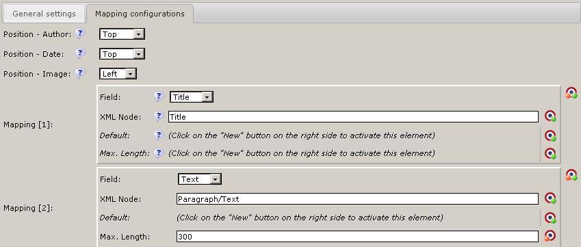
- Tab "Mapping configurations"
- Position - Author:: The position of the author relative to the entry. Options: Top, Bottom.
- Position - Date:: The position of the date relative to the entry. Options: Top, Bottom.
- Position - Image:: The position of the image relative to the entry. Options: Left, Right, Top.
- Mapping:
- Field: The field in the list box entry.
- XML Node: The XML path to the element in the XML content.
- Default: The default value if the element in the XML content is empty.
- Max. Length: The maximum length of the text, which will be used.
Example
The screenshot of the Template III demo content shows several examples how to make use of a List in OpenCms 8 Templates.
In the center you can see two Lists formatted for the center column. They both show only 2 resources (can be configured with "Items per page" or "Collector" options).
In the right column a list is configured to fit into a box, with truncated text and resized Image.
Collector
The Collector is an OpenCms widget of the type com.alkacon.opencms.v8.list.CmsCollectorSelectWidget.
It defines the resources to display in the dynamic list.
Choose one of the available collectors:
- allInFolderPriorityDateAsc
- allInSubTreePriorityDateAsc
- allInFolderPriorityDateDesc
- allInSubTreePriorityDateDesc
- allInFolderPriorityTitleDesc
- allInSubTreePriorityTitleDesc
- allMappedToUriPriorityDateAsc
- allMappedToUriPriorityDateDesc
- singleFile
- allInFolder
- allInFolderDateReleasedDesc
- allInFolderNavPos
- allInSubTree
- allInSubTreeDateReleasedDesc
- allInSubTreeNavPos
- allInFolderDateDesc
- allInFolderDateAsc
- allInSubTreeDateDesc
- allInSubTreeDateAsc
- timeFrameAndCategories
- allKeyValuePairFiltered
- allVisited
- allSubscribed
- allSubscribedDeleted
- allChangedInFolderDateDesc
- allChangedInFolderDateAsc
- allChangedInSubTreeDateDesc
- allChangedInSubTreeDateAsc
The parameter for the collector has to be set. The parameter should contain the path to the resources to collect, the resource type to collect and the number of resources to collect.
/_contents/events/e_%(number).html|v8event|2 The path to resources to collect |Resource type | Number of resources
The path of resources to collect can be also contain a macro like %(link1), to be defined in the optional "Links" field where you can pick a validated vfslink. If you want to pick only resources of a given name pattern then use a macro expression like e_%(number).html, which limits the selection to file names with the prefix "e_" followed by any number and then the suffix ".html".
As resource type any available resource type known to the OpenCms core can be entered. Do NOT use the Nice name.
The number of resources to collect correlates with the optional "Items per page" that get shown.
Mapping
The tab "Mapping configuration" features several options how the collected resources should be displayed in the list output.
Assuming that most resources will be of the type v8article or its descendants v8news or v8events the fixed attributes Author, Date, Image can be assigned a Position in the displayed list element.
In Addition the every XML node of the chosen resource type could be mapped to a preset of fields.
As list output might need truncation, a maximum length of text output can be preset.
OpenCms 8 Dynamic Function
Since OpenCms 8.0.2 a new resource "Dynamic Function" is introduced. The new resource type makes it possible to drag and drop a dynamic content provided by a JSP directly into a container page of the web site. Typical use case is extending of the web site by a search or login functionality.
The OpenCms 8 Dynamic Function is not part of the Template III but is used by several Template III modules.
The OpenCms 8 Dynamic Function is a new core functionality included in the org.opencms.ade.containerpage module.
The locale is provided by the request parameter specified in the XML content.
The OpenCms 8 Dynamic Function allows to define:
- Tab "Main parameters"
- Title: The title of the dynamic function
- Description: Here you can enter a descriptive text what this dynamic function is used for.
- Function provider: Select the path to the JSP that encapsules the functionality as a vfslink.
- Parameter:
- Key: Key of the parameter.
- Value: Value of the parameter.
- Formatter options:
- Type: Here you can enter a formatter type like center or sidecolumn.
- Minimum: Here you can enter a minimum width for the formatter JSP
- Maximum: Here you can enter a maximum width for the formatter JSP
- Tab "Element Settings"
- Element Settings:
- Setting name:
- Display name:
- Description:
- Type:
- Widget:
- Default:
- Widget configuration:
- Rule regex:
- Rule type:
- Error:
- How to use "Dynamic Function"
- Drop a new resource of type "Dynamic Function" into the container page and configure it as XML content from ADE.
- Set the title, which is used for this resource in the add wizard.
- Define the path to the jsp, which provides the required functionality in the xml field "Funtion provider".
- Some optional request parameters can be defined in the XML field "Parameters".
- In the XML field "Formatter options" the type of the container as well as its min and max width can be defined to control the container, in which this resource can be dropped.
- Additionally define the setting in the second tab directly in the XML content editor. Use the same options as inside of the scheme definition for the resource type.
Important note: The html output provided by the used jsp should be surrounded by a <div> tag, similar to the formatter JSP.
OpenCms 8 Login Form
The Template III Login Form comes as a separate module com.alkacon.opencms.v8.login.
The Template III Login Form is implemented as a "Dynamic Function" since OpenCms 8.0.2 and is of resource type function.
The Template III Login Form can be used to provide Log in functionality for a protected area on the website.
OpenCms 8 Search Form
The Template III Search Form comes as a separate module com.alkacon.opencms.v8.search.
The Template III Search Form is implemented as a "Dynamic Function" since OpenCms 8.0.2 and is of resource type function.
The Template III Search Form offers full text search on the website.
- Search configuration (as parameters for "Dynamic Function")
- Search Index: VFS search index for Search Management in OpenCms Administration.
- Search source: Defines the path to be searched (e.g. root "/").
- Matches pro page: Here you can enter maximum number of displayed search results per page. With pagination more results will be displayed on next pages.
- How to use the search form
- Drop a search box from ADE's Add wizard "Dynamic Function" list to the left or right column.
- The parameter 'searchformlink' needs to be set and point to the search result page (e.g. /flower-en/flower-search/)
- Add a new search form detailpage from ADE's Add wizard "Dynamic Function" list to the designated search result page (e.g. /flower-en/flower-search/)
- To use the SearchResult.JSP as function provider the following parameters may be set:
- 'searchIndex' to set the index searched, default: 'Online project EN (VFS)'
- 'searchRoot' to set the folder to be searched, default: '/'
- 'searchMatchesPerPage' to set the number of results displayed per page, default: '5'
Now the search results are displayed on the detail page (e.g. /flower-en/flower-search/)
OpenCms 8 Twitter Feed
The Template III Twitter Feed comes as a separate module com.alkacon.opencms.v8.twitter.
The Template III Twitter Feed adds an official Twitter widget and provides functionality to define a Twitter Feed with:
- Title: The title of the twitter feed
- User: The twitter user. Tweets of this twitter user will get displayed (e.g. AlkaconOpenCms)
- Backgroundcolor:Please select the color of the twitter feed.
- Links Color: Please select the color for the links.
In ADE one can directly edit the twitter feed's "Element Settings". Options are:
- Twitter box height: The height of the twitter box
Implementation details
- Dynamic include of additional javascript and css
- New tag <cms:headinclude> has been added to the template <head> :
 <!DOCTYPE HTML PUBLIC "-//W3C//DTD HTML 4.01//EN" "…">
 <html><head>
   […]
   <cms:headincludes type="javascript" />
   <cms:headincludes type="css" />
   […]
 </head><body>
 […]
- New node <headincludes> has been added to the XML Schema Definition com.alkacon.opencms.v8.twitter/schemas/twitter.xsd:
 [..]
 <xsd:annotation>
   <xsd:appinfo>
     […]
     <headincludes>
       <headinclude type="javascript" uri="http://widgets.twimg.com/j/2/widget.js" />
       <headinclude type="css" uri="/system/modules/…/resources/css/style.css"/>
     </headincludes>
   </xsd:appinfo>
 </xsd:annotation>
- Excerpts of Twitter Feed Formatter JSP com.alkacon.opencms.v8.twitter/formatters/all.jsp:
 <cms:formatter var="content" val="value">
   <div class="twitter-box">
     <c:choose>
       <c:when test="${cms.edited}" >
         <p> Please reload </p>
       </c:when>
       <c:otherwise>
         <script type="text/javascript">
           new TWTR.Widget(
             […]
             ).start();
         </script>
       </c:otherwise>
     </c:choose>
   </div>
 </cms:formatter>
Dev Demo Template
The OpenCms 8 Developer Demo provides a collection of technology examples and common use cases. It consists of several small examples, so that each example is easy to understand.
All demo examples have a similar structure:
- Each demo example has its own sub-sitemap.
- The path to the sub sitemap of a demo example is:
- /sites/default/dev-demo/{example-name}/
- The path to the sub-sitemap configuration of a demo example is:
- /sites/default/dev-demo/{example-name}/.content/.config
- The path to the content of a demo example is:
- /sites/default/dev-demo/{example-name}/.content/
- The Dev Demo contains the following examples
Formatter demo
Image scale demo
This example demonstrates how to scale the size of an image dynamically. The scaling depends on the width of the container, in which this article is dropped. The image size is set dynamically inside of the formatter using container width. You have to define the container width as an attribute of the <cms:container> tag inside of the template. Then you can access the container width inside of the formatter.
Settings demo
For this example several settings were defined in the xml schema definition of the article. The values of the settings are accessed inside of the formatter and used for example to control the layout options of this article on this containerpage.
Dynamic function demo
Demo of the dynamic function
Since OpenCms 8.0.2 a new resource "Dynamic Functionality" is introduced. The new resource type make it possible to drag and drop a dynamic content provided by a jsp directly into a container page of the web site. Typical use case is extending of the web site by a search or login functionality.
In this demo example a simple date display is added in a box, which can be dropped in one of the side containers. The settings are used to set the format and the style of the date. The locale is provided by the request paremeter specified in the xmlcontent.
How to use "Dynamic Functionality":
- Drop a new resource of type "Dynamic Funcionality" into the container page and configure it as xmlcontent from ADE.
- Set the title, which is used for this resource in the add wizard.
- Define the path to the jsp, which provides the required functionality in the xml field "Funtion provider".
- Some optional request parameters can be deifined in the xml field "Parameters".
- In the xml field "Formatter options" the type of the container as well as its min and max width can be defined to control the container, in which this resource can be dropped.
- Additionally define the setting in the second tab directly in the xmlContent editor. Use the same options as inside of the scheme definition for the resource type.
Container variables demo
Access of the container variables
Specific information about differnet containers on a container page as well as adjusted information of a container element is provided by org.opencms.jsp.util.CmsJspStandardContextBean. This bean is available from a jsp like formatter, as soon as the container page is rendered. The values of the bean are adjusted depending on the element it is called from. In order to access the CmsJspStandardContextBean from a jsp use a predefined EL variable ${cms}.
In this demo different variables available inside of the current element are displayed. These variables describe the current state of the container page and of the current container.
Headinclude tag demo
In OpenCms 8 it is possibe to use additional javascript or css files to display a specific resource type. The paths to the additional files can be set inside of the resource type scheme. The referenced files are loaded dynamically, if the reource type is used on a container page.
To include the javascript or css files follow the inscructions:
- Reference the javascript or css files inside of the resource type scheme using <headinclude> node.
Please compare:
/system/modules/org.opencms.dev.demo/schemas/article_with_headincludes.xsd
- Use the javascript or css information inside of the formatter of the resource type.
- Add following lines to the html <head> area of the template:
<cms:headincludes type="javascript" />
<cms:headincludes type="css" />
Paste script Demo
With OpenCms 8 you can paste scripts like Facebook Like Button directly inside of your content, by defining a special area inside of the formatter.
Define two different contents areas inside of the element formatter using ${cms.edited} varible. If the page have been reloaded the part of the html code containing the pasted scripts is displayed. If the element have been edited or moved the alternative part of the html without scripts is displayed. In that case the user can be reminded to reload the page.
Model Containerpage Demo I
A model is a default copy model for the containerpages, where common content which should appear on all new containerpages is defined. Usually the containerpage model is in folder of the sub sitemap:
/{sitefolder}/{sub sitemap path}/.content/.new/
In order to use the model, its path has to be set in the sitemap configuration inside of the tab "Page Models".
The defined page model will then appear as first in the list of containerpages in the "Create Page" dialog of the sitemap editor. In order to have a nice name for the new page model, please edit additionally its title property. If set as default this model is also used to create the new page, when it is added over the context menu in the sitemap editor. Futher use the disabled checkbox of the page model configuration to control the visibility of the inherited page models from the upper sitemaps.
Model Containerpage Demo II
Group Container Demo
A Group Container is a content element referencing a group of other content elements. It is rendered as if it’s sub elements where referenced directly by the container page. A Group Container allows to maintain the referenced elements in one place to take effect on many pages.
Add a group container to the model container page of the sitemap, if you would like to achieve following effects on the website:
- A common content part, which is repeated on all pages.
- All changes like editing, creating new elements or deleting inside of the group container will effect all pages using this page model.
How to use the group container
- one Open the group container editor by cliking on the edit button of the group element. The group container editor appears in an overlay. Now only the group container elements and the title and description property can be edited.
- two Drag and drop, edit or delete the existing elements inside of the group container.
- three Drop a new element to the group container.
- four Save the changes by clicking ok on the group container editor.
Template-Generator
You may try this generator to create your own templates based on the V8-Demo-Templates.
